Climate Change: Winners and Losers
Lesson 2: Earth's Climate History
Page 1 Page 2: Glaciers Page 3 ReviewGlaciers
As we saw on the previous page, average global temperatures have risen rapidly over the past 100 years or so. This is a fact. We know this is true because scientists have been measuring temperatures all over the globe during this time. As we go back in time, however, things become a little less certain because we don't have actual physical measurements of the temperature. So we have to rely on other indicators of past temperatures. Some of the things that climate scientists look at to infer temperatures in Earth's distant past include tree rings, chemical changes in ice cores and ocean sediments, and fossil evidence. Although none of these types of evidence is as certain as an actual temperature measurement, when several different types of evidence all point to the same conclusion, then we can be fairly certain that our conclusions are accurate.
Here is a graph of global temperatures over the past 800 thousand years. Compare this graph with the graph on the preceding page. This graph represents 800 times as much climate history as the first graph:
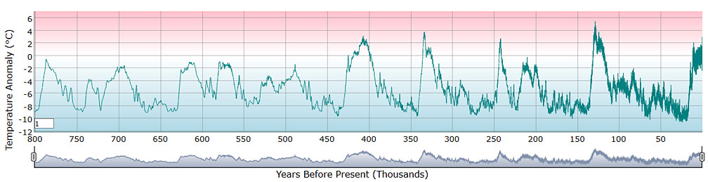
This graph shows that global temperatures have changed a lot over this time, ranging from as much as 10ºC (18ºF) below average to almost 6ºC (11ºF) above average.
Perhaps you have heard of ice ages--times in Earth's history when worldwide temperatures were cooler and massive sheets of ice, called "glaciers" covered much of our continent. During the last ice age, which ended about 20,000 years ago, the area where we are now living was buried under a thick sheet of ice over 1 mile high.
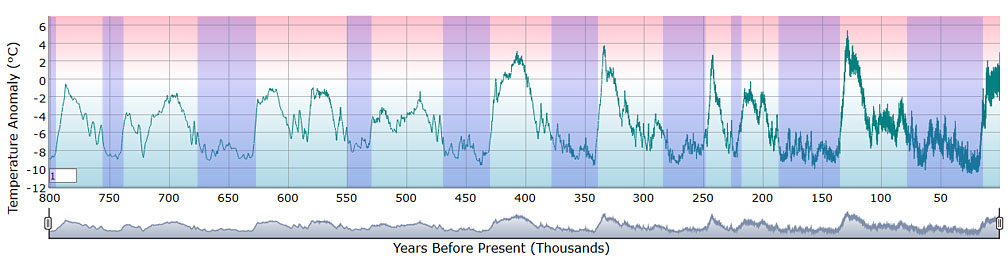
On this graph I've marked the periods over the past 800,000 years when global temperatures were low. These are periods when glaciers advanced and covered much of North America. Notice that except for a brief exception about 225,000 years ago, ice ages occurred roughly every 100,000 years, and they lasted for about 25,000 to 50,000 years.
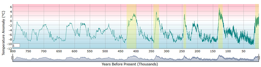
On this graph I've marked periods when global temperatures increased rapidly and stayed above average for an extended time. These periods are called interglacial phases. During these warm interglacial phases, glaciers retreated toward the poles and eventually disappeared. The Arctic Ocean at the North Pole melted and was often free of ice.
Notice how we are currently in an interglacial phase. We would expect temperatures to be warm now, and we should expect glaciers and sea ice to melt. So can we really blame human activity for the sudden increase in temperatures? Actually, yes. History suggests that we should be nearing the end of this interglacial phase, and temperatures should start to decline. (They were declining on the left side of the graph on Page 1.)
The graph on this page ends at about where the graph on Page 1 begins, with global temperatures about 3ºC (5.5ºF) above the long-term average. If we keep adding CO2 to the atmosphere at the current rate, temperatures will increase an additional 4.4ºC (8ºF) by the end of this century, bringing them up to 7.4ºC (13.3ºF) above average. That's off the top of this graph.
How unusual is this? To answer that question we need to take an even longer-range view.
Go to Page 3